Finding your style! Let's talk filters!
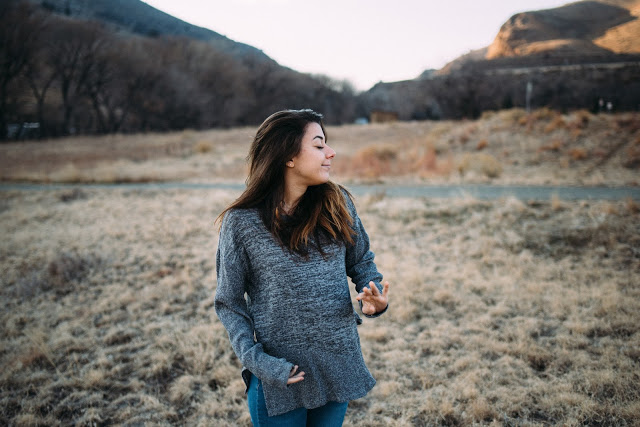
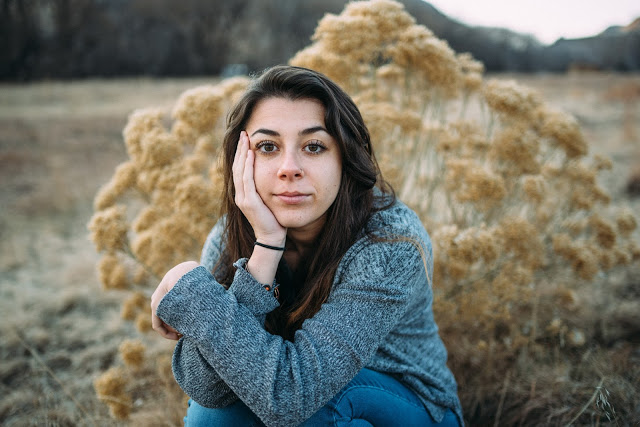
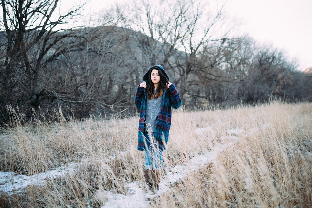
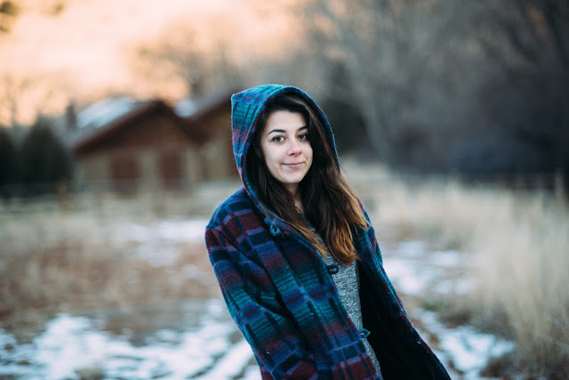
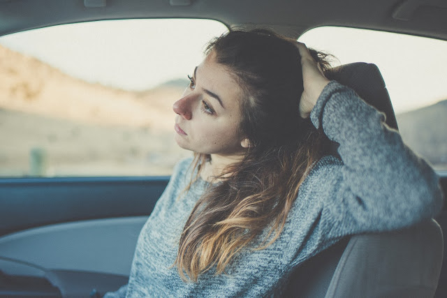
I adore a warm tone to a picture!
Any sort of creative person, artist, creator of beautiful things...will each have a different eye for not only HOW we see things, but the visual style we are attracted to. This blog is about the way photographers enhance the feeling of their images through coloring, saturation, clarity choices.Taking a step or two back, a LONG time ago, the only form of photography was with film. Different films had different "looks". These looks could be in the form of different tones of colors, grainy or not, warm or cool, saturated or more mild, etc.... When you knew you would be shooting on a beach full of sun and you wanted your colors to pop, you would pick a different film than you would if you were shooting in say, a more dense and darker forested area, or even indoors. It was fun to experiment with films and really find a look that was super appealing to you! I almost always shot with Fuji films, after experimenting with what was available. There were some Kodak films that I liked, but just like you are either a Canon or a Nikon shooter, I was a Fuji girl versus Kodak. Nothing against Kodak, I just preferred the look of my Fuji for what I was shooting!
In 2017 (almost 2018), most photographers shoot digitally, but still like to play with different looks just as if you were playing with different films. If you ever pick up a magazine, scroll through Instagram or see a movie, you will see that pictures/video can take on a HUGE variety of looks. They can be muted, softer colors, ultra vibrant, teal/orange (very popular combo right now), brownish, pink or green undertones...and the list goes on and on (think Instagram filters x1000). There are a lot of photographers that call these different looks/filters/presets a fad (colors being represented as anything that strays from what the natural eye would see, ie, the "true" colors), and won't touch them with a 10 foot pole. I personally really REALLY love the variety we are seeing AND the creativity it can allow us!!! The other really cool thing I like about using different looks is that to me, each image I take, or that I see, tells a different story. That story can be expressed even more eloquently and profoundly by the style, color enhancements, amount of saturation, whatever, that are applied to the digital file. I LOVE THESE OPTIONS!!
With ALL of these really REALLY cool options for how to make your image tell the story you want it to, there is a need to have SOME sort of consistency, for those of us who photograph professionally. People want to know what they are going to get, and rightfully so! If they know you edit with a heavily de-saturated and moody style with a heavy green undertone, they know they can expect that from a session with you and may be one of the big reasons they choose you as a photographer!
I have come to decide that for myself, I am able to incorporate a slew of different emphases and as long as the image is post processed in a way that isn't obvious, does that make sense? What I mean is, my end goal is to have people get lost in the emotion of a picture and not be thinking about anything else!
I hope that you take time to really play around with looks to help you find YOUR style, whatever it may be! It is so unique to each person, and I definitely can pinpoint where my eye leans predominantly, even if I incorporate a variety of different looks, to make my image complete!!
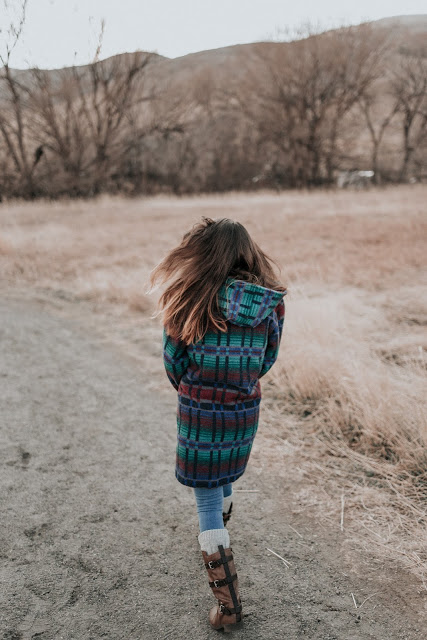
Sharing some of the images shot from a recent session with Gabby. We chased, and missed, the sunset, but we got some beautiful light nonetheless!
